Myodetox is a Physiotherapy company who needed to move beyond the world of recovery into the world of health & wellness. The brand felt intimidating and cold, preventing them from growing beyond their space. We created a visual language that would re-position them as an accessible vitality brand.

BRAND APPLICATION
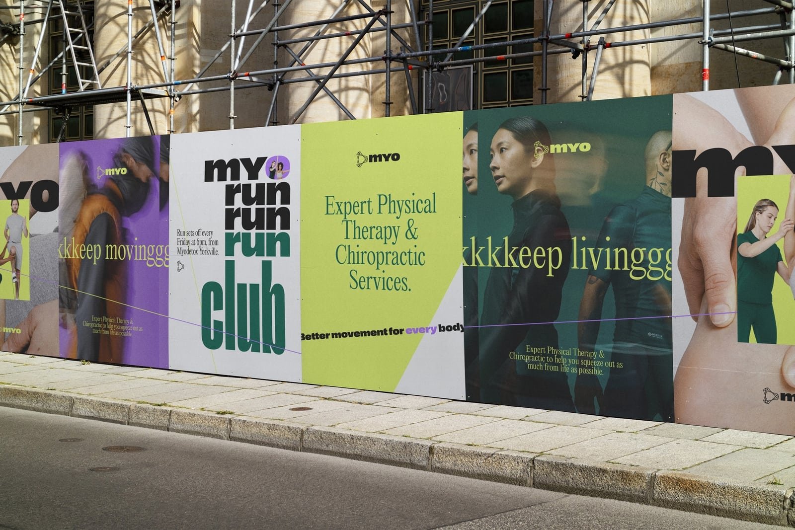
We introduced a new graphic language that made their brand collateral an extension of the logo. The various lines represents the connectedness of the body. A bright, inviting and energetic palette was introduced to make the brand feel , accessible and alive.


PHOTOGRAPHY
Lifestyle photography was introduced to show people living their lives vs. only being treated in the clinic. The intent was to shift the focus from selling a service to selling an outcome of service – better living. * Lifestyle photography used on this page are placeholder to communicate the concept.
*All photography used on this page are placeholder to communicate the concept.


Design Director
Greg Washington
Design & Art Direction
Natalie Papanikolov
Strategy
Michael Bercasio
Copy
Kate Bowen
Services
Art Direction
Brand Strategy
Brand Identity
Graphic System
Brand Collateral